
20% Adoption Growth Through Simplified Dashboard Redesign
A SaaS enterprise platform that replaces traditional maritime logbooks with a unified, digital dashboard for real-time vessel analytics and operations tracking.
2025-Present
Lead UX Designer
Data & visuals restructed due to NDA
The Viswa Group

Background
VLOG 360, by Viswa Group, is used by 100+ maritime clients across 12 countries to manage voyages. It brings together real-time insights on engine health, emissions, compliance, forecasting, and more—all in one streamlined dashboard.
Context
Despite its powerful features, the platform wasn’t easy to use. Dense layouts and unclear hierarchy led some users to turn to simpler tools. As the only designer on the team, I partnered with the product owner and engineers to reimagine the system into a modern, user-friendly SaaS product.

Problem Statement
The company's operations platform did its job but wasn’t easy to use—cluttered layouts, unclear structure, and low engagement often pushed users toward simpler tools. As a solo designer on the team, I worked with the product owner and engineers to reimagine the system, turning it into a modern, user-friendly SaaS product that makes complex operations easier and more intuitive.
Background
VLOG 360, developed by Viswa Group, is trusted by over 100 maritime clients across 12 countries. The platform helps manage voyages with real-time insights on engine health, emissions, compliance, forecasting, and more—all within a single, seamless dashboard designed to simplify complex operations.
Project Overview
While the platform met functional needs, it struggled with usability due to dense information layout, unclear hierarchy, and limited user engagement Leading some users switch to simpler third-party tools
As a solo designer on the team, I collaborated with the product owner and engineering team to conceptualize and build the SaaS platform. My task was to transform a legacy system into a modern, user centered product that support complex maritime operations with clarity and efficiency.
Design System
Expanding the existing design system to improve visual consistency
Information Architecture
Restructuring the dashboard and IA to prioritize key insights.
Data Visualization
Enhance data visualization to make complex metrics more accessible
Highlighting 2 Key focus areas
- Digital Logbook Dashboard-
Redesigned the VLOG360 (Renamed to Viswa) to improve readability, by data prioritization and easier tracking of necessary actions.
- Vessel data redesign -
Improved the dashboard by organizing real-time metrics like emissions, engine health, and voyage data into a more visual, accessible, & decision-friendly layout.
Project Overview
While the platform met functional needs, it struggled with usability due to dense information layout, unclear hierarchy, and limited user engagement Leading some users switch to simpler third-party tools
As a solo designer on the team, I collaborated with the product owner and engineering team to conceptualize and build the SaaS platform. My task was to
Data Visualization
Enhance data visualization to make complex metrics more accessible
Information Architecture
Restructuring the dashboard and IA to prioritize key insights.
Design System
Expanding the existing design system to improve visual consistency
Highlighting 2 Key Projects

Digital Logbook Design
Redesigned the VLOG360 to improve data input flows, enhance readability, and ensure easier tracking of daily vessel operations with better structure and consistency.

Vessel Status Redesign
Improved the dashboard by organizing real-time metrics like emissions, engine health, and voyage data into a more visual, accessible, & decision-friendly layout.
Digital Logbook Daashboard
Old Design
This dashboard page from the old portal serve as the central hub for vessel managers and onboard crews. It provided access to essential maritime logbooks and compliance records.
Logbooks
Repetitive tile based layout not allowing prioritization and focus
Alert Notification
Small top banner without action buttons and doesn't consider the design for multiple alerts

"The data overload and lack of visual hierarchy makes it hard to prioritize"
32 out of 40 users that we interviewed agreed to this statement
All key vessel data — including oil, fuel, garbage, emissions, and engine information — is organized in a tile-based layout. This allows crew members and managers to monitor each phase individually.
BUT..
There is a lack of prioritization and a need to emphasize urgent action notifications to be addressed with quick actions and have more visibility in the fast paced environment.
Can You Spot the Priority Here?
“Everything looks the same — I can't tell what's the priority or important”
24 out of 40 users that we interviewed, agreed to this statement
All key vessel data — including oil, fuel, garbage, emissions, and engine information — is organized in a tile-based layout. This allows crew members and managers to update and monitor the status of each area throughout the voyage.
Additionally, reports can be viewed and shared with stakeholders for better coordination & decision-making.

Introducing
Viswa Group, a smarter way to track vessel operations, turning raw maritime data for the people who keep ships moving.
The best part
Restructuring the dashboard we empowered users to not just view information — but act on it
Resulted
User Adoption and engagement
Tab view to group and prioritize log books relevant to each user
Dedicated default homepage for alert notifications with quick action buttons
Dark theme to help enhance data visuals with the use of colors while maintaining brand identity
Vessel Data Re-design
Observational User Testing
Task: Find and review the latest emissions report.


Find the log book card for emission reports
Read through the emission report table by finding the specific row
Note down observations on paper/third party apps
But do our users really need a revamp?
To answer this, we conducted a SWOT analysis to evaluate the product from both user and business perspectives.


“We need to see trends, patterns, and alerts — at a glance”
6 out of 7 stakeholders and leads validated to this statement
- Non-technical users, especially onboard crew, expressed concerns about understanding KPIs or interpreting charts without training.
- Concerns were raised around data accuracy, syncing delays, and whether real-time insights would be reliable at sea.
- Different user roles needed different insights — but most feared a one-size-fits-all dashboard.
SWOT Revealed
“We need to see trends, patterns, and alerts — at a glance”
6 out of 7 stakeholders and product leads validated this need
Different user roles needed different insights — but most feared a one-size-fits-all dashboard.
Concerns were raised around data accuracy, syncing delays, and whether real-time insights would be reliable at sea.
Non-technical users, especially onboard crew, expressed concerns about understanding KPIs or interpreting charts without training.
Typical User Workflow Stages

Mapping Insights to the Right Visuals

But do they already have data analytics?
Of-course they do! But, Is it easy to grasp the information? Not really
The go-to destination for analytics
Engineers frequently keep the dashboard open to quickly monitor live vessel performance. The information helps them track ongoing metrics and report updates to the vessel head—making it a crucial part of the platform.
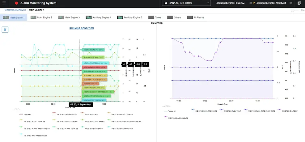
Isn’t this too complicated?
Yes — for a real-time or at-a-glance diagnostic tool, this is visually overwhelming

What we did?
Breakdown graphs by combining 2 relatable data points -- Intensive research and understanding of each data priorities helped make decisions on best combinations to simplify data grasping.
Does this grouping help simplify the experience for the user?
Grouped layout improves clarity, but a high-level overview at eye-level supports faster decision-making—just like the original interface.
74% of users said this layout improved clarity


Final Iteration
We tested several layout versions and gathered feedback to identify what helped users most. The final design balances detailed insights with a simplified, task-focused structure.
Hover interactions reveal exact data points, matched with their designated line colors to maintain visual consistency and reduce cognitive load.
Digital Logbook Redesign
Redesigned the VLOG360 to improve data input flows, enhance readability, and ensure easier tracking of daily vessel operations with better structure and consistency.
